Making a powerful streaming platform easier to operate
- Role
- Senior Product Designer
- Focus
- Platform UX · App workflows · Design systems
- Users
- Non-technical and semi-technical operators
- Product
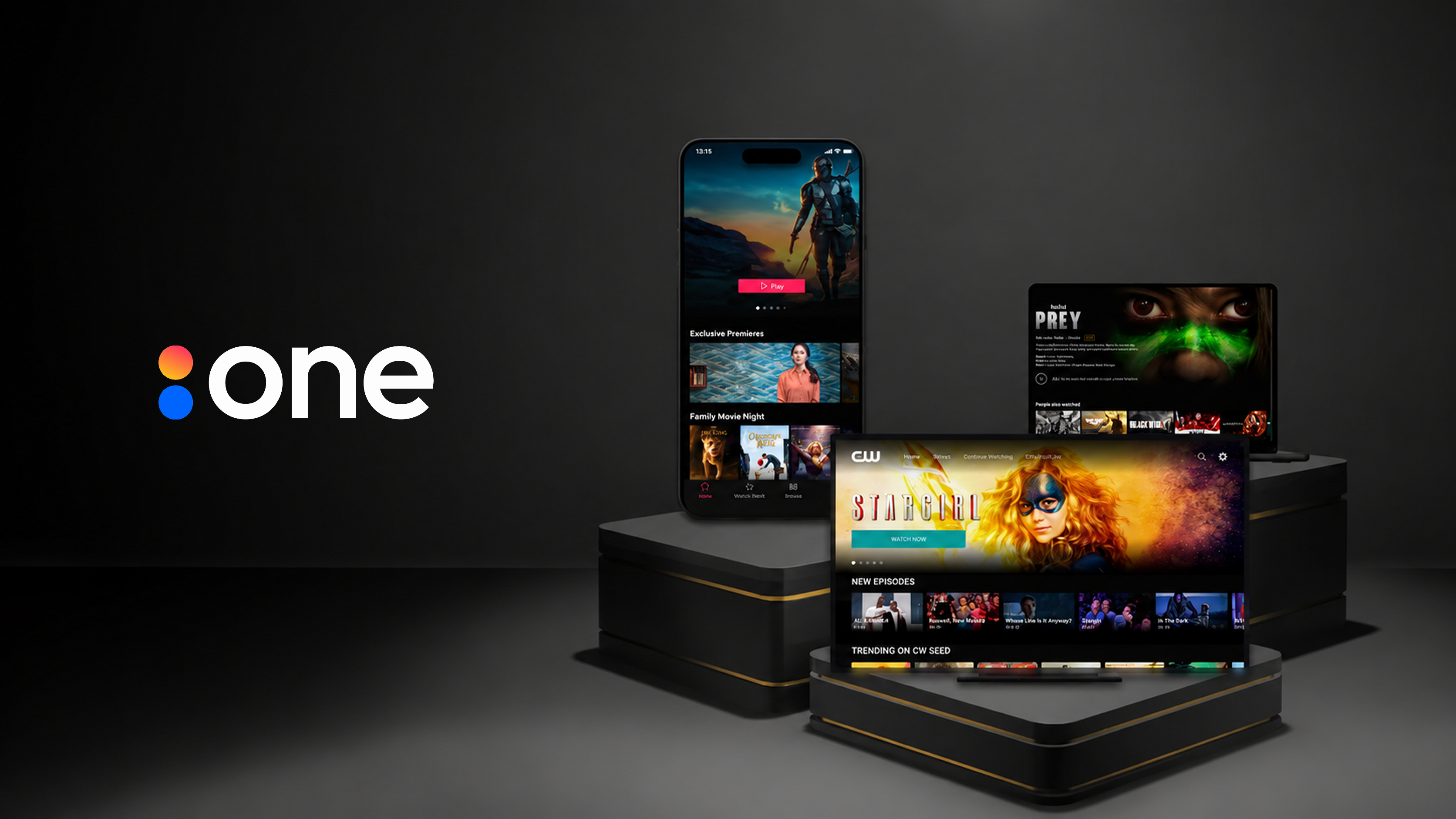
- Streaming platform / app builder
Overview
Accedo One was used by people with different levels of technical confidence — from teams managing day-to-day content to users working with more technical configuration and delivery workflows.
The challenge wasn’t simply to make the platform simpler. It was to make context, terminology, next steps, and consequences clearer without removing the flexibility customers needed.
My role
I worked hands-on across UX, UI, interaction design, design-system components, implementation reviews, and design QA. My work spanned both the Accedo One Admin platform and app experiences across mobile, web, and TV, supporting customers building and managing streaming applications.
I also held customer design reviews, reviewing apps built with Accedo One and helping teams improve layout, navigation, content presentation, and make better use of the tools already available to them.
How I worked
End-to-end ownership
Owned features from early exploration through detailed UX/UI and implementation.
Continuous collaboration
Worked closely with the PO, product designer, PMs and engineers through frequent brainstorming and weekly design reviews.
Iterative delivery
Designs evolved through product and technical feedback, sprint planning and implementation, while keeping the end-user at the center of decisions.
Design challenge
The recurring design problem was balancing clarity with flexibility — making complex workflows easier to understand without removing functionality experienced users still needed.
Making complex platform workflows easier to use
Across Accedo One, I worked on both Admin workflows and consumer-facing capabilities. The examples below show how I simplified complex configuration tasks, created more consistent platform patterns, and designed reusable experiences across devices.
01 — Guided content-container setup
Challenge
Creating a content container required users to make several related configuration decisions, but the existing flow offered limited guidance about what to choose, in what order, or what would happen next.
Design response
I broke the setup into a clearer sequence of explicit decisions, so each choice could be understood before moving on.
Guided wizard sequence
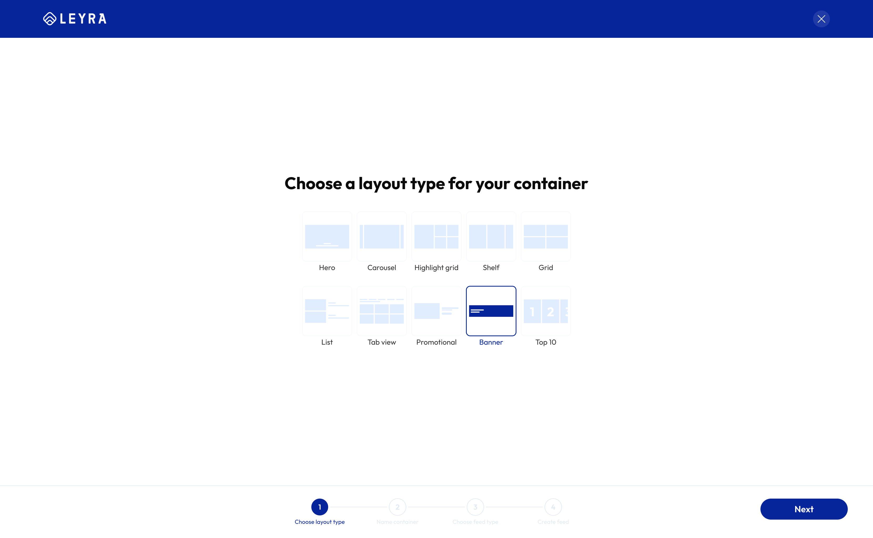
1. Choose container layout type
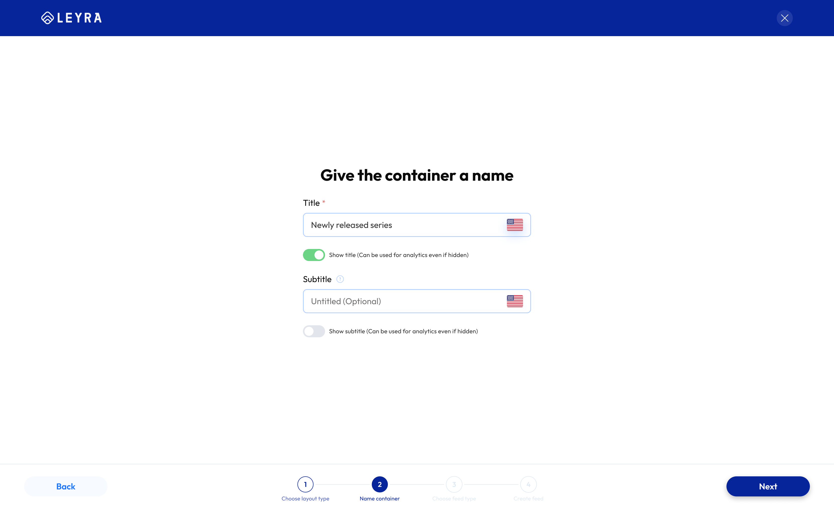
2. Name the container
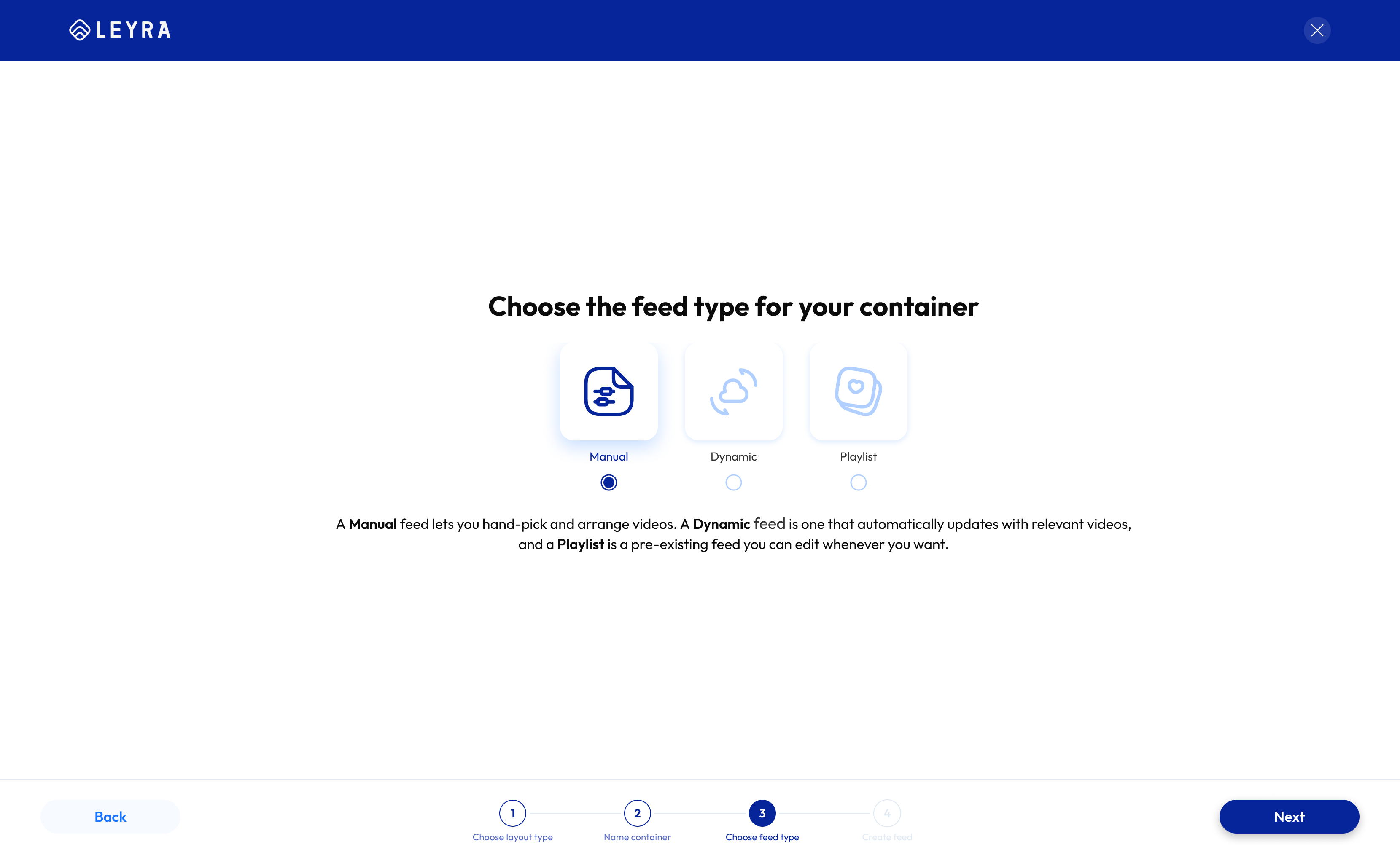
3. Choose container feed type
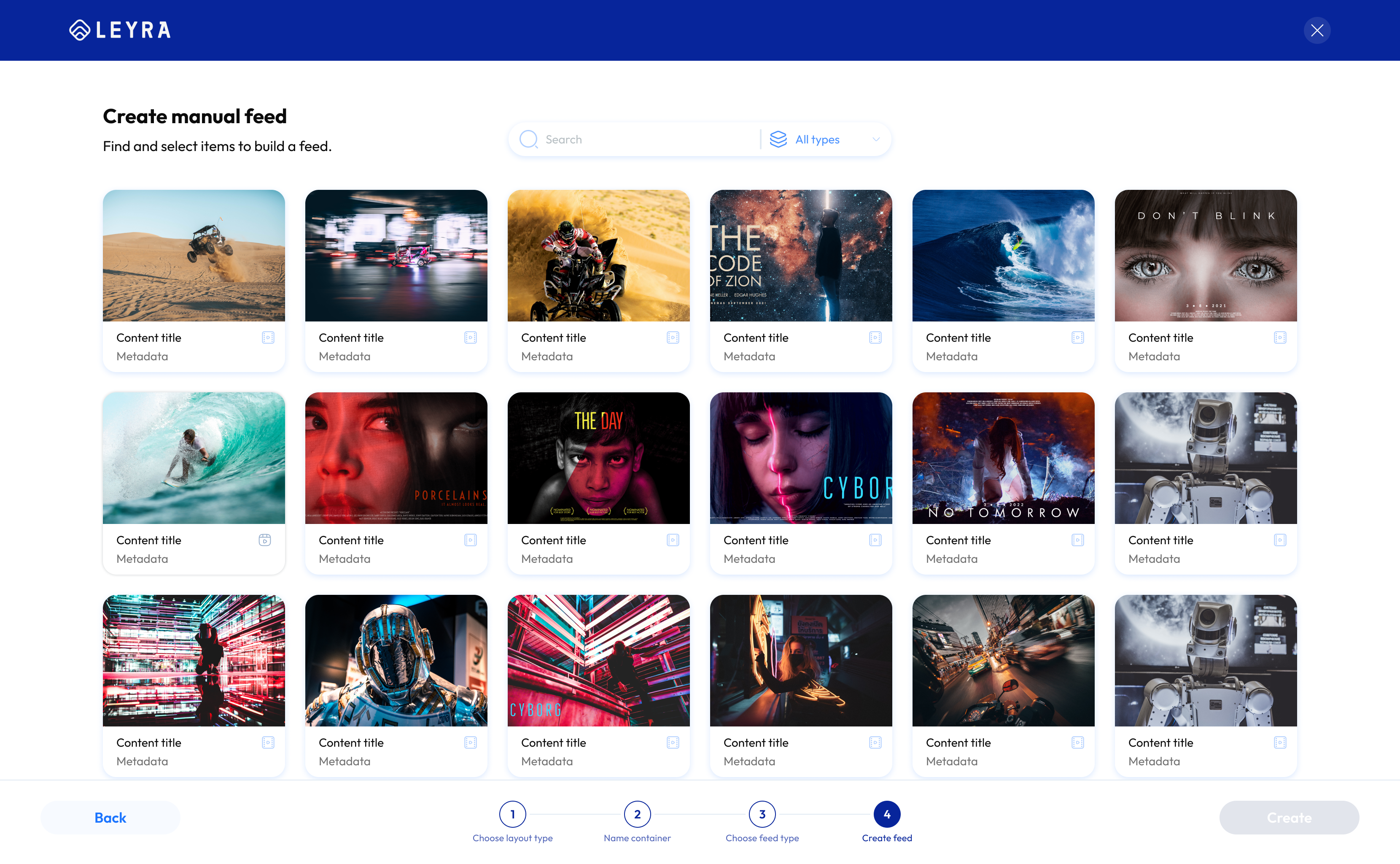
4. Configure manual feed
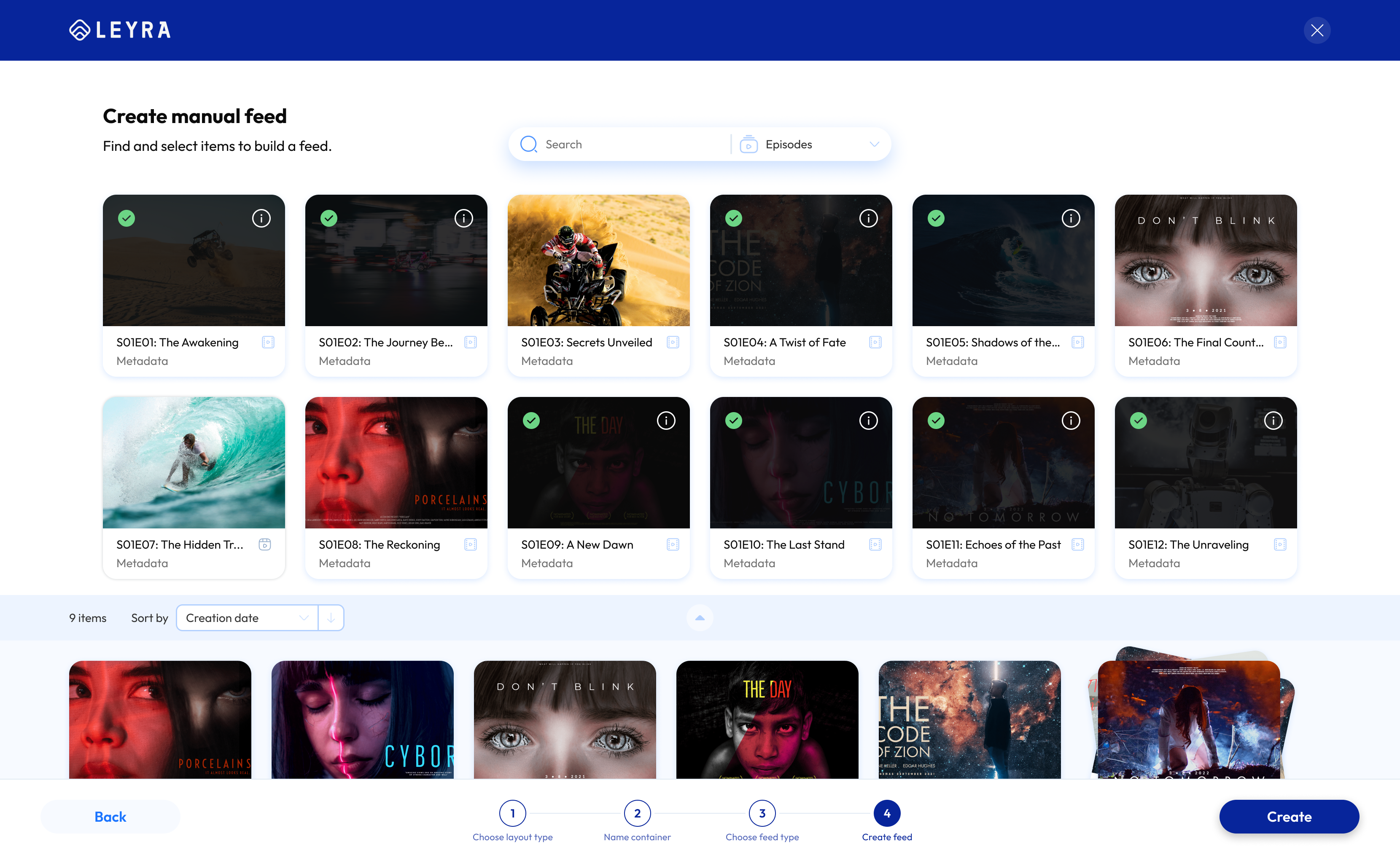
5. Review and create selected playlist
From less guided setup to a guided wizard
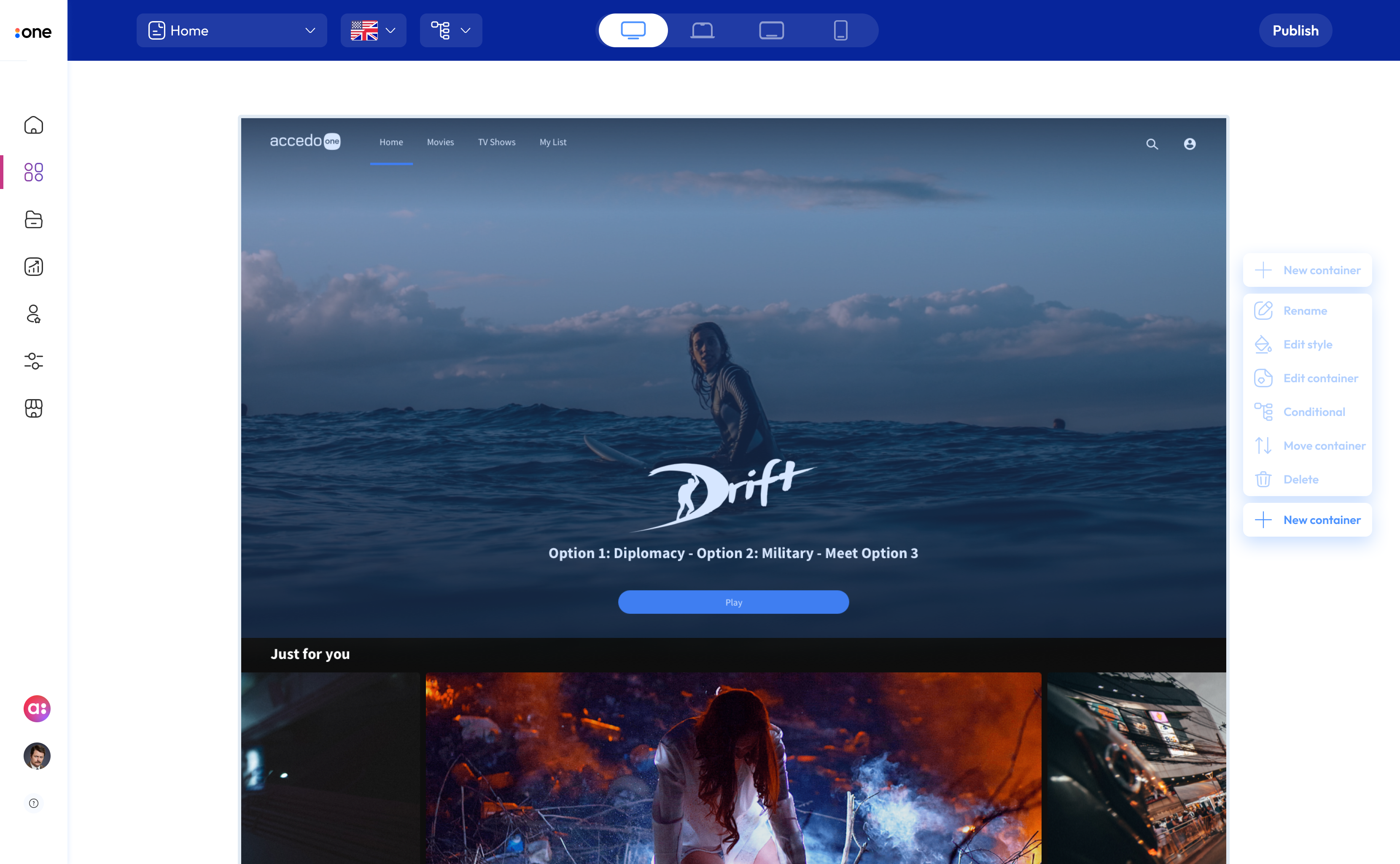
Less guided setup
The earlier flow placed container setup inside the Editor app preview, with limited guidance around the order of configuration decisions.
Choose layout type
The wizard introduced a clear first step, helping users begin with layout before moving through the rest of the setup sequence.
Clearer review before creating the container
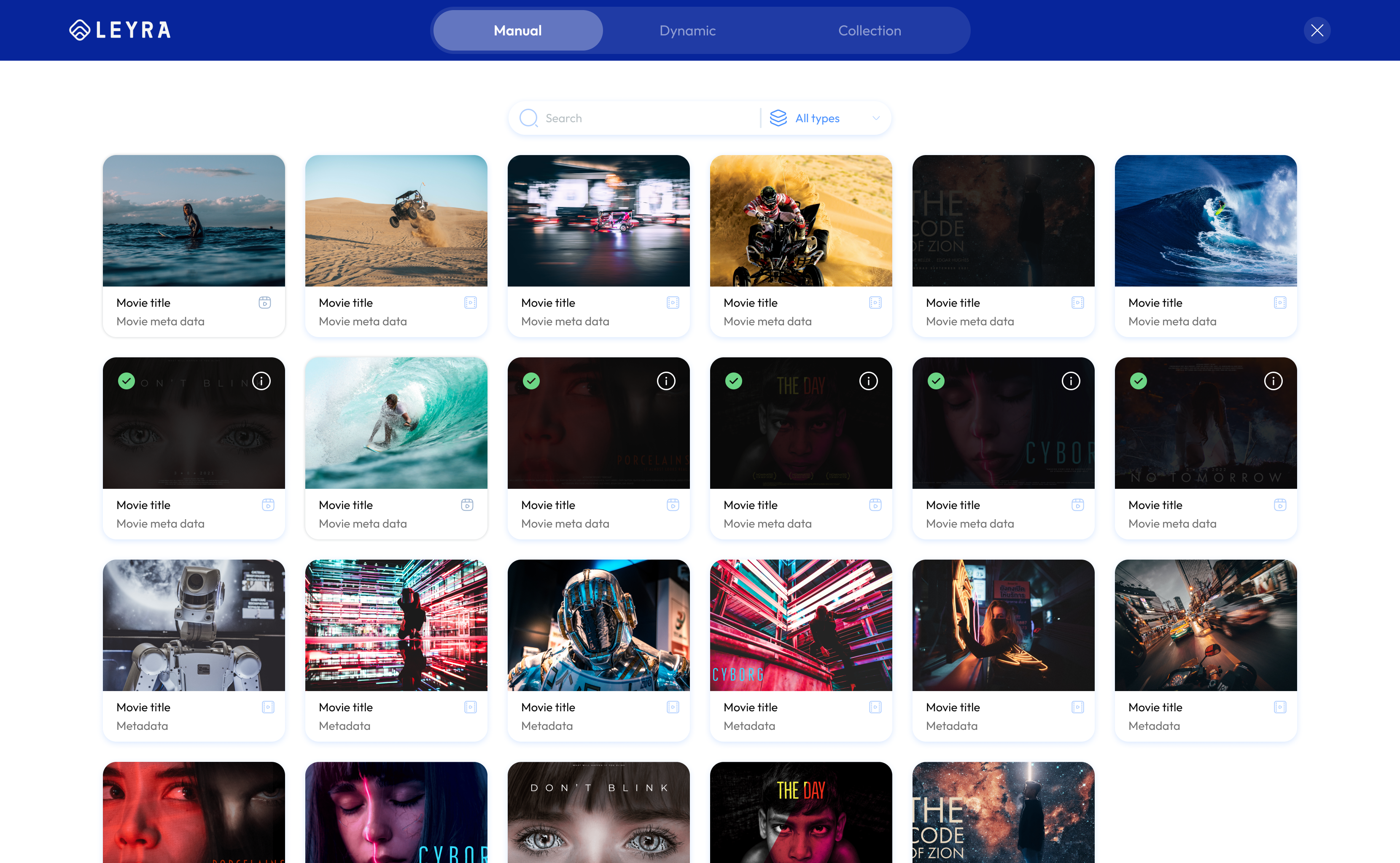
Harder to review before creating
The earlier final step made it harder to review selected content and confirm the create action before finishing.
Review selected items and create
The wizard ended with a dedicated review step for the selected manual feed, making selected items and the final create action clearer before completing setup.
Outcome
The previous setup flow was a known source of customer confusion and support calls. I redesigned it with a guided experience that explained container types and next steps. The redesigned flow later shipped as part of the customer-facing Admin experience.
02 — Build workflow
Challenge
Users had to interpret build status, version information, publishing actions, and failures within the same technical workflow. Important states and available actions were not always immediately clear.
Design response
The redesign focused on making status, available actions, and failure information easier to understand while preserving the technical information users still needed.
Build list clarity
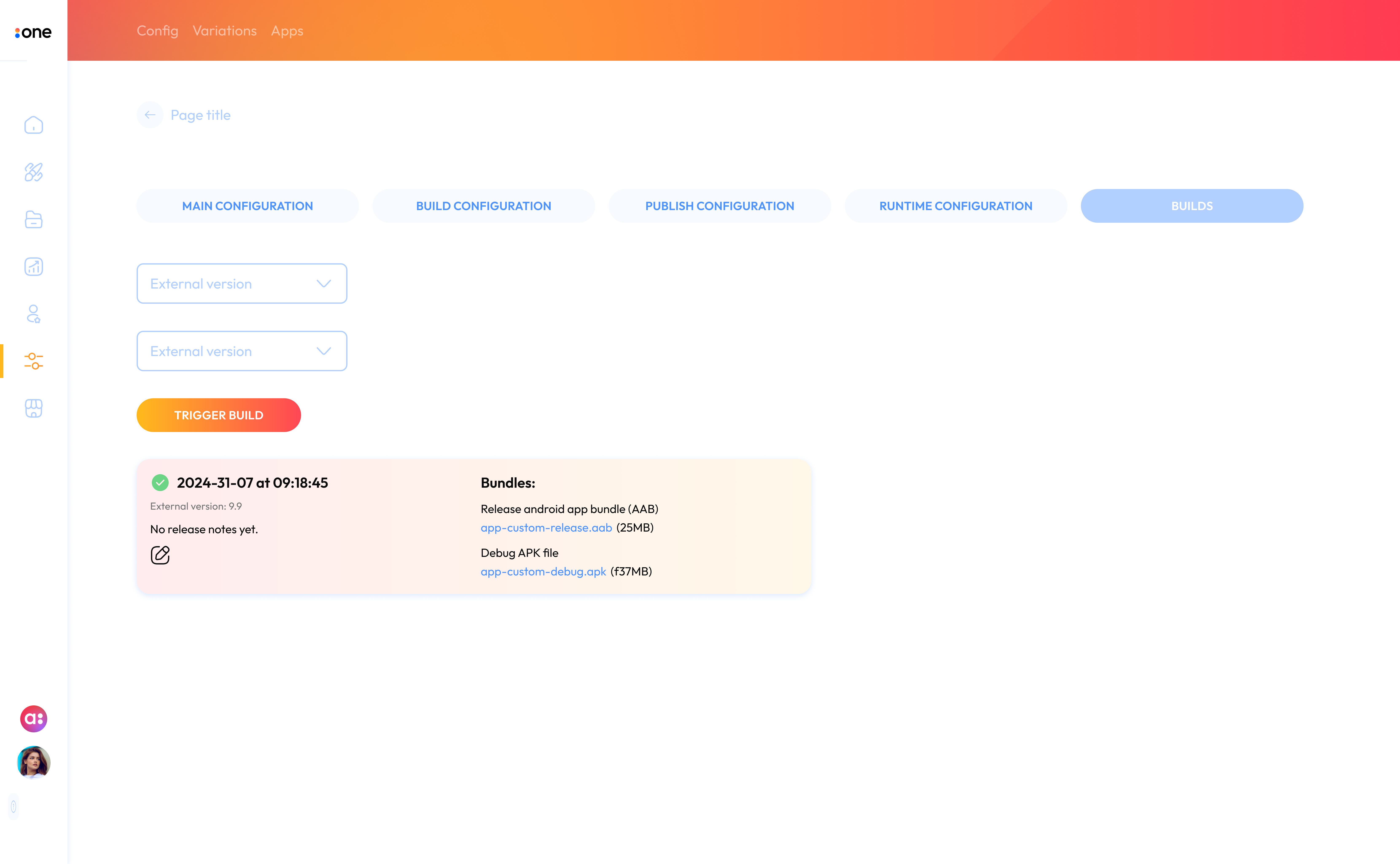
Earlier
Build information was shown in a compact card layout, making status, version details, and available actions harder to scan at a glance.
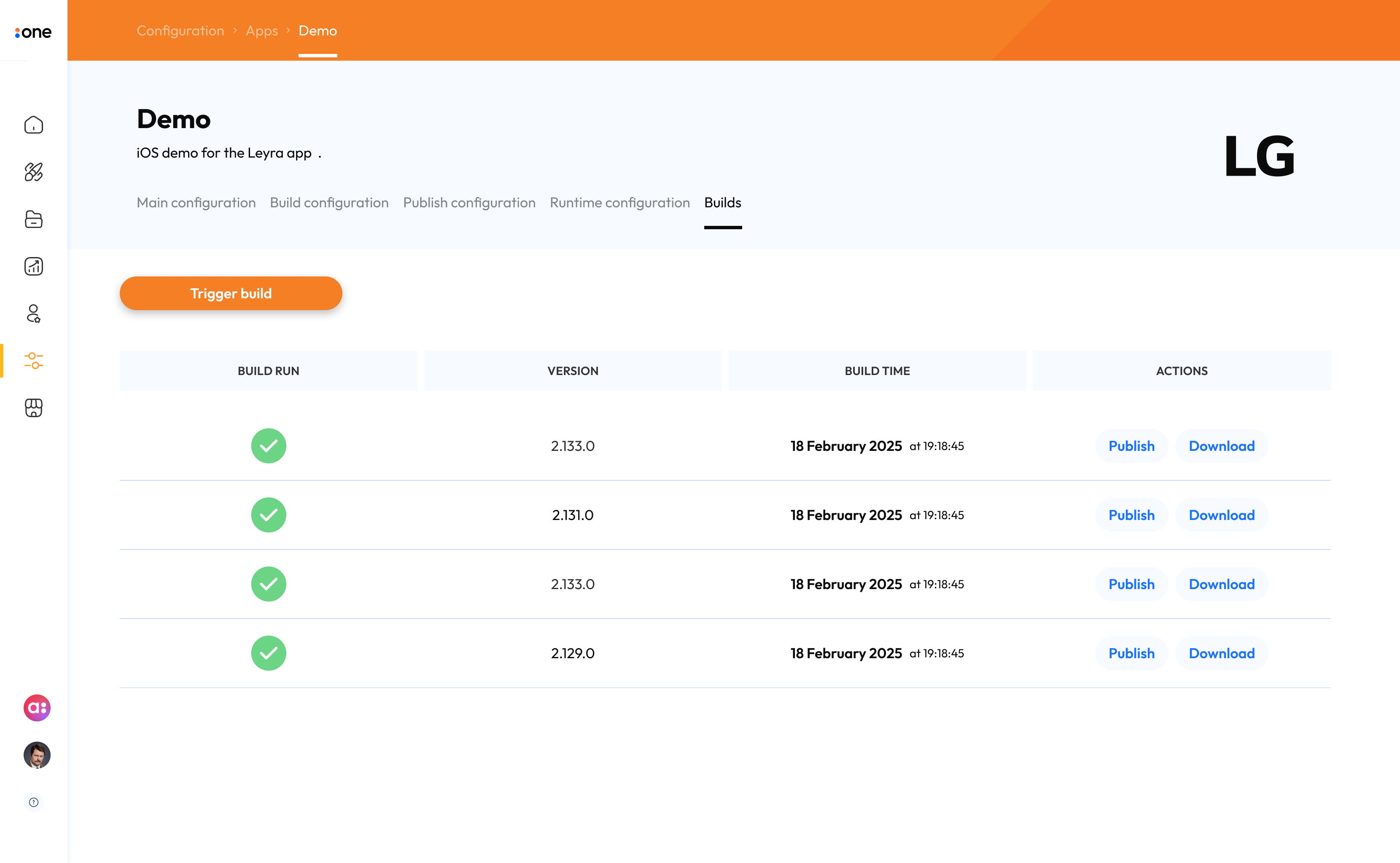
Redesigned
The redesigned view added clearer app context and configuration navigation, then moved builds into a table structure so status, version, build time, and actions were easier to compare and act on.
Triggering a build
Earlier
The trigger build action sat within the page flow, with limited guidance around the selected version and next step.
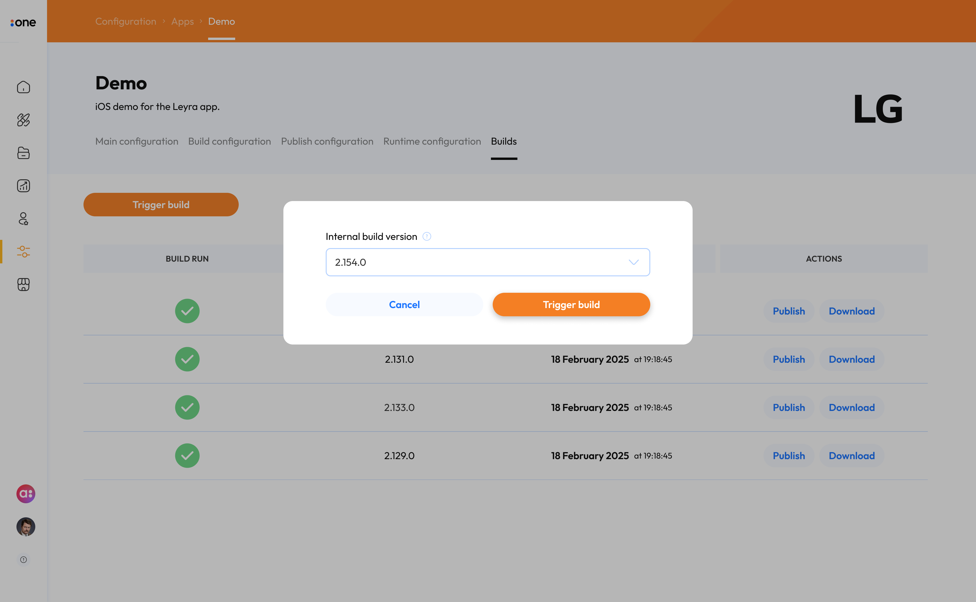
Redesigned
A focused modal clarified the selected build version and gave the user a clear primary action before starting a new build.
Failed build handling
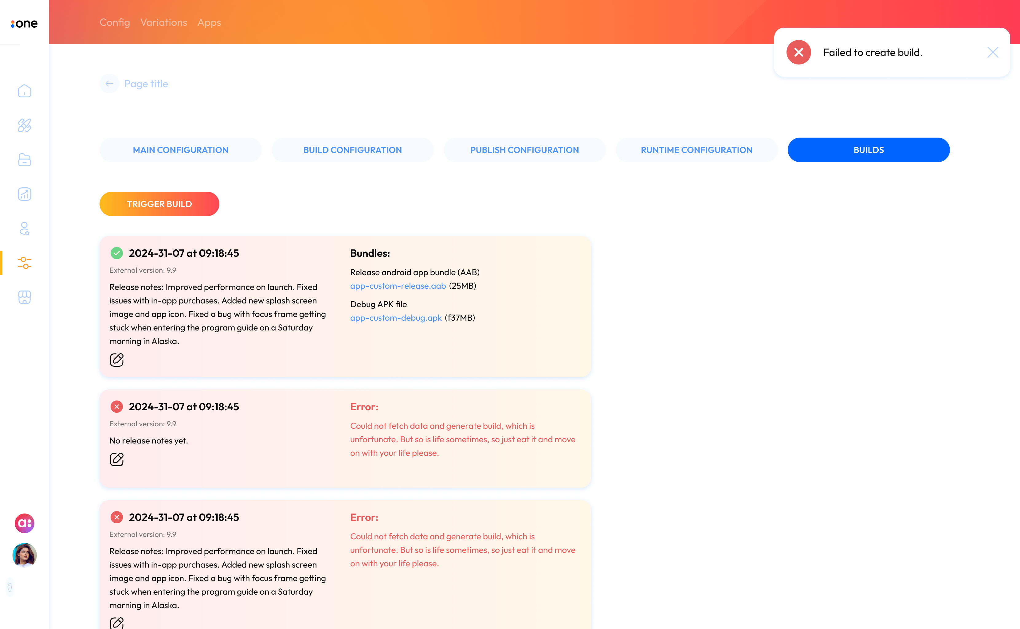
Earlier
Error information was present, but it was harder to scan and understand what needed attention or where to find more detail.
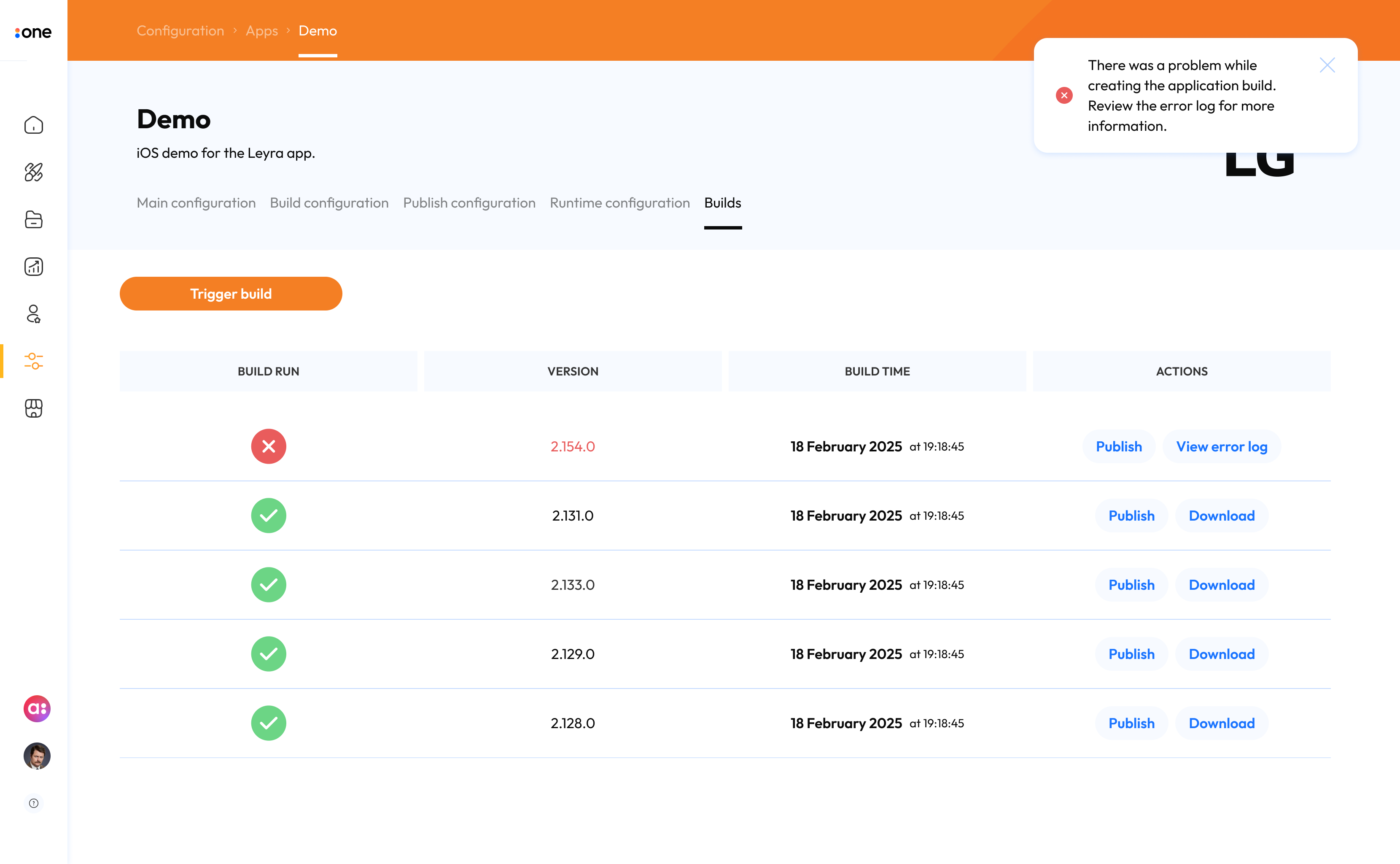
Redesigned
The failed state made the problem more visible and provided clearer access to logs or supporting information for troubleshooting.
Outcome
The redesigned Build workflow was introduced internally first and received positive feedback from internal stakeholders. It also created the foundation for a more self-service model in which customers could eventually manage app builds without relying on Accedo One developers.
Headers and navigation
Challenge
As the Admin experience evolved, page headers and navigation patterns had become inconsistent across different areas. The existing color combinations also failed to meet accessibility requirements for contrast, creating issues with readability and navigation clarity.
Design response
I created a shared header system with clearer hierarchy, more predictable navigation, and stronger contrast across Admin areas. I used AI-assisted contrast checking during color exploration to test combinations against accessibility requirements, then refined the palette so the final background and text combinations exceeded the minimum contrast targets.
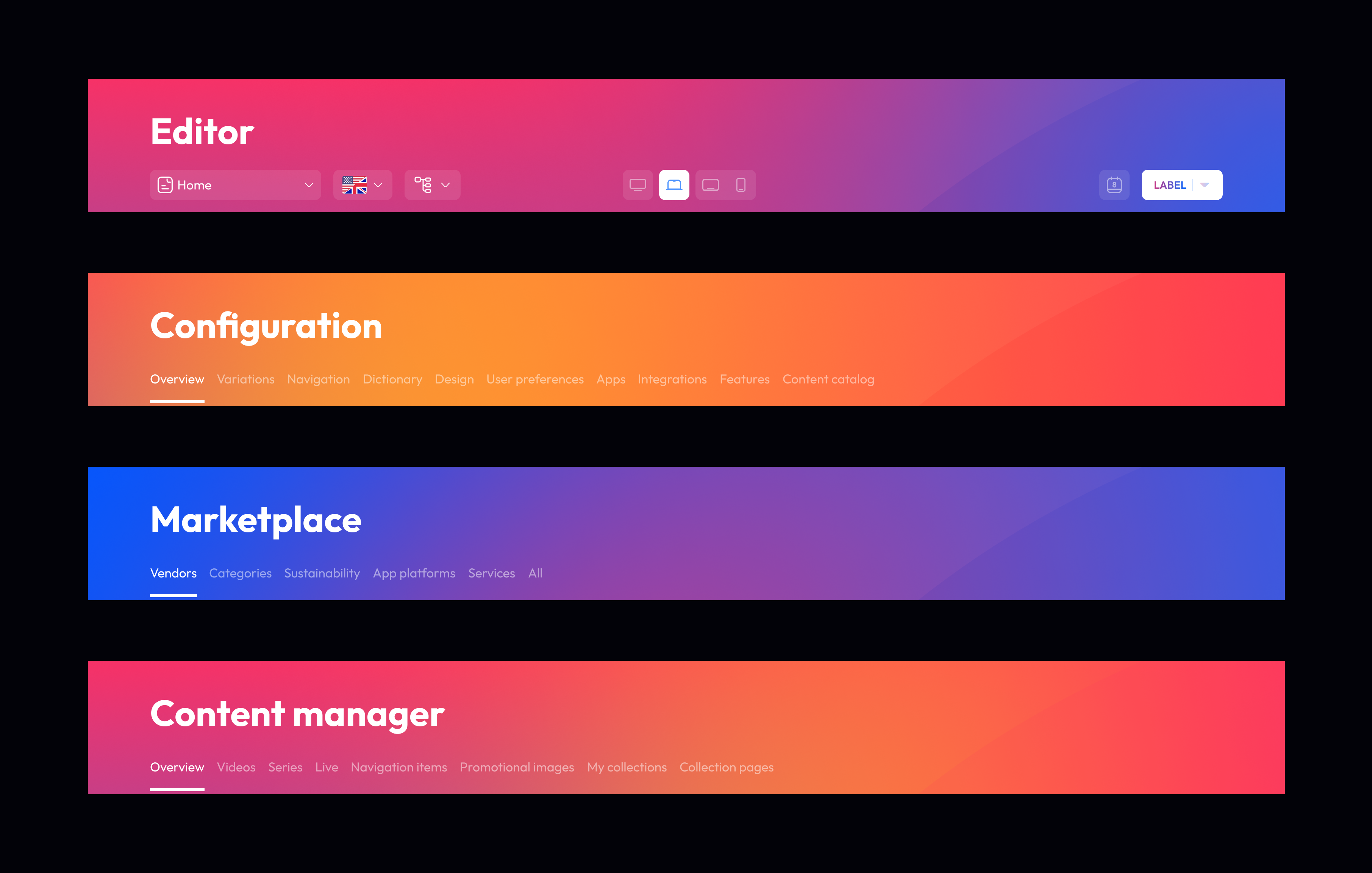
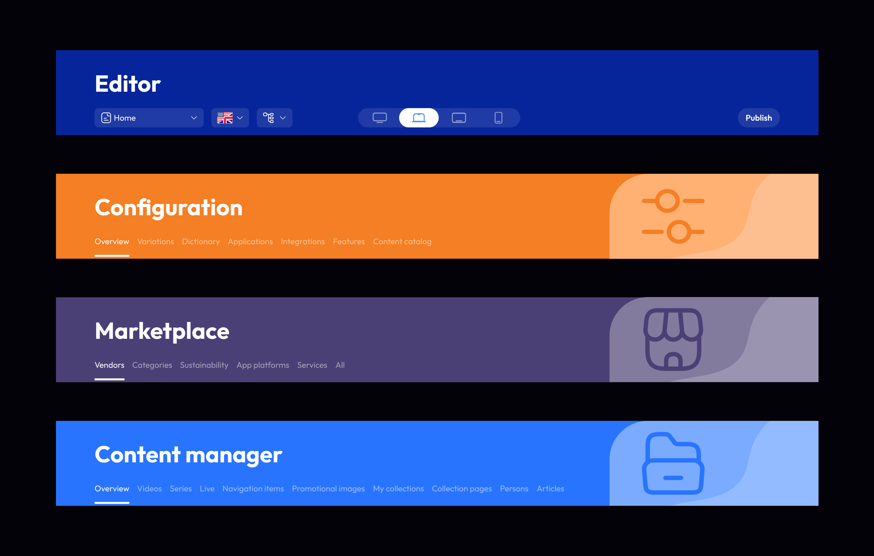
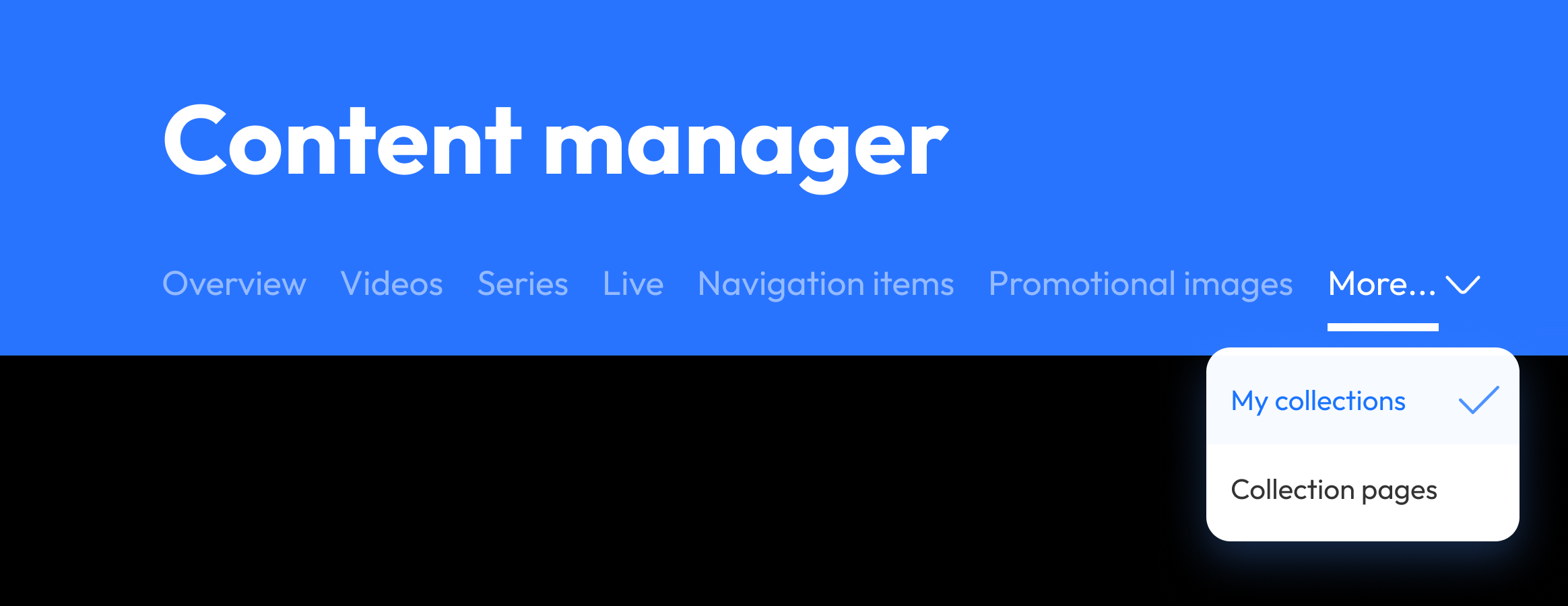
The redesigned header and navigation shipped into the core Admin experience, giving customers a more consistent and accessible foundation for building and managing their services.
Beyond Admin
Keep listening while continuing to browse
As Accedo One began supporting more news and radio customers, users needed audio to continue playing while they moved through the rest of the app, without losing access to playback controls.
Challenge
The playback model needed to stay consistent across mobile, tablet, web, and TV, while placement, controls, focus behaviour, and interaction adapted to each device.
Design response
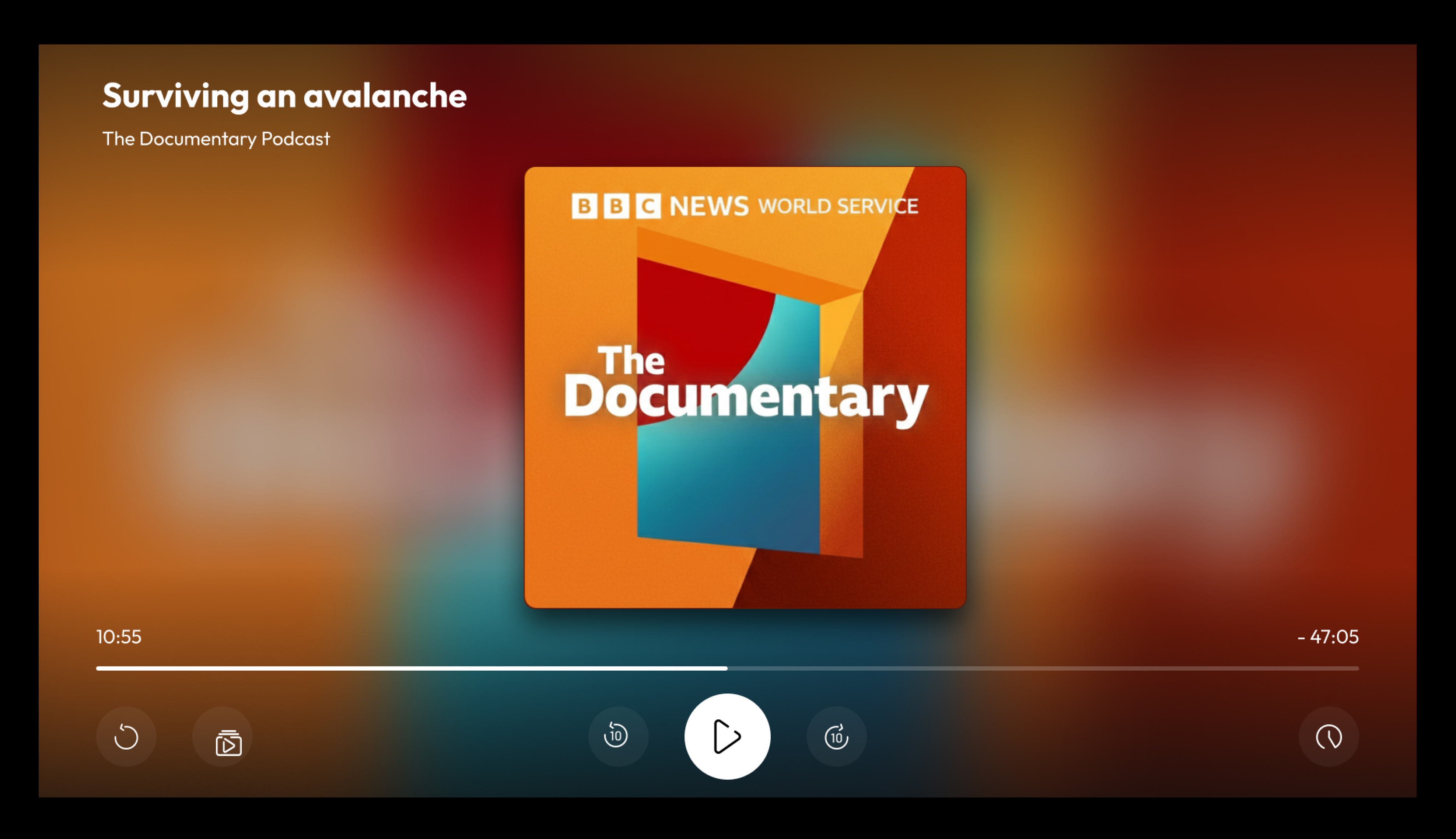
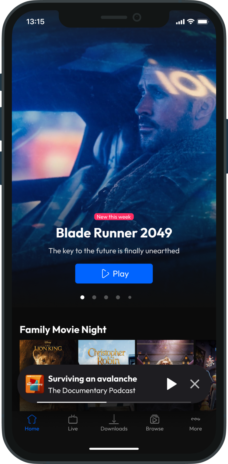
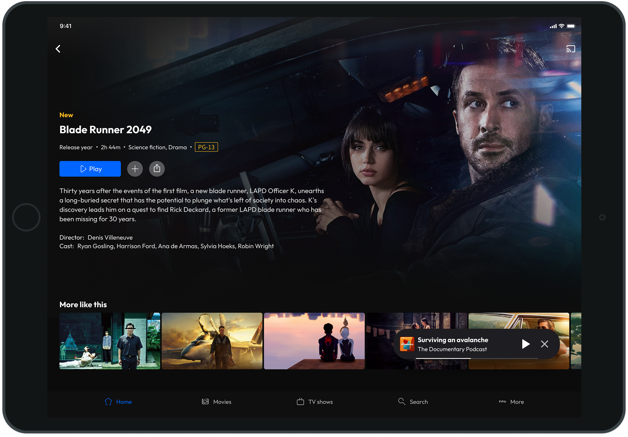
I designed a shared playback model with two connected states: a persistent mini-player so audio could continue while browsing, and a focused full-player for more detailed controls. The same core model was reused across mobile, tablet, web, and TV rather than designing separate solutions for each platform, with interaction adapted to each device and input method.
How the pattern worked
A persistent mini-player kept playback accessible while browsing, then expanded into a focused listening view.
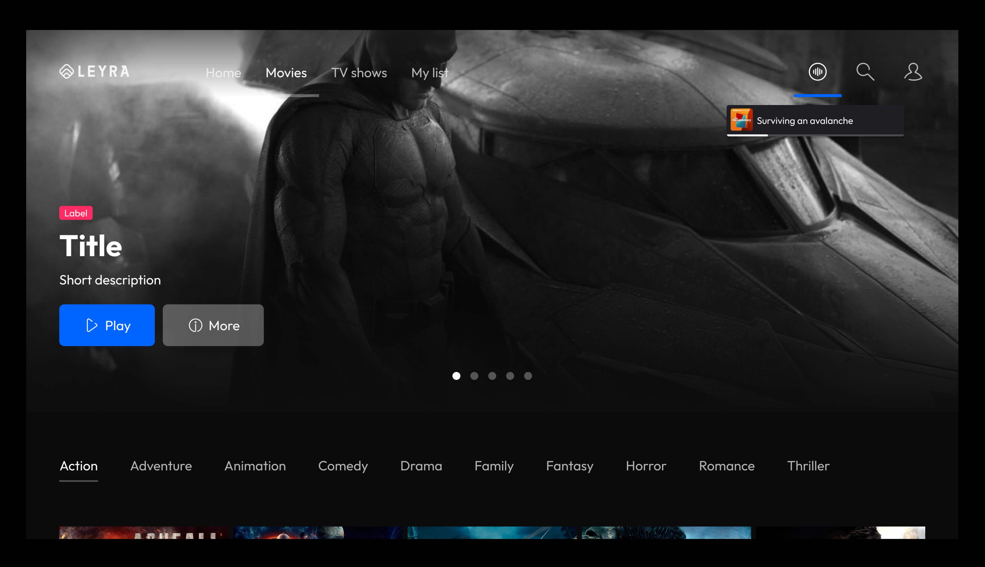
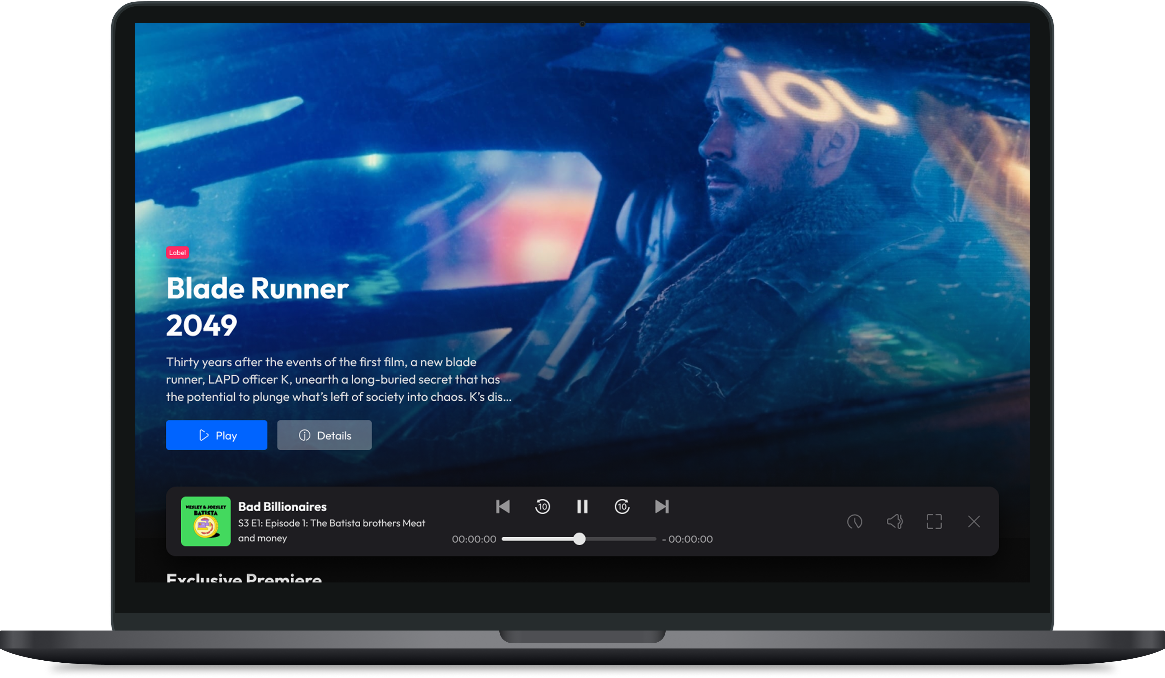
Mini-player across devices
The same core playback model was reused across devices, with placement and interaction adapted to each platform.
Expanded player examples
The full-player state gave people a more focused listening view with detailed controls, while keeping artwork and progress familiar across touch devices.
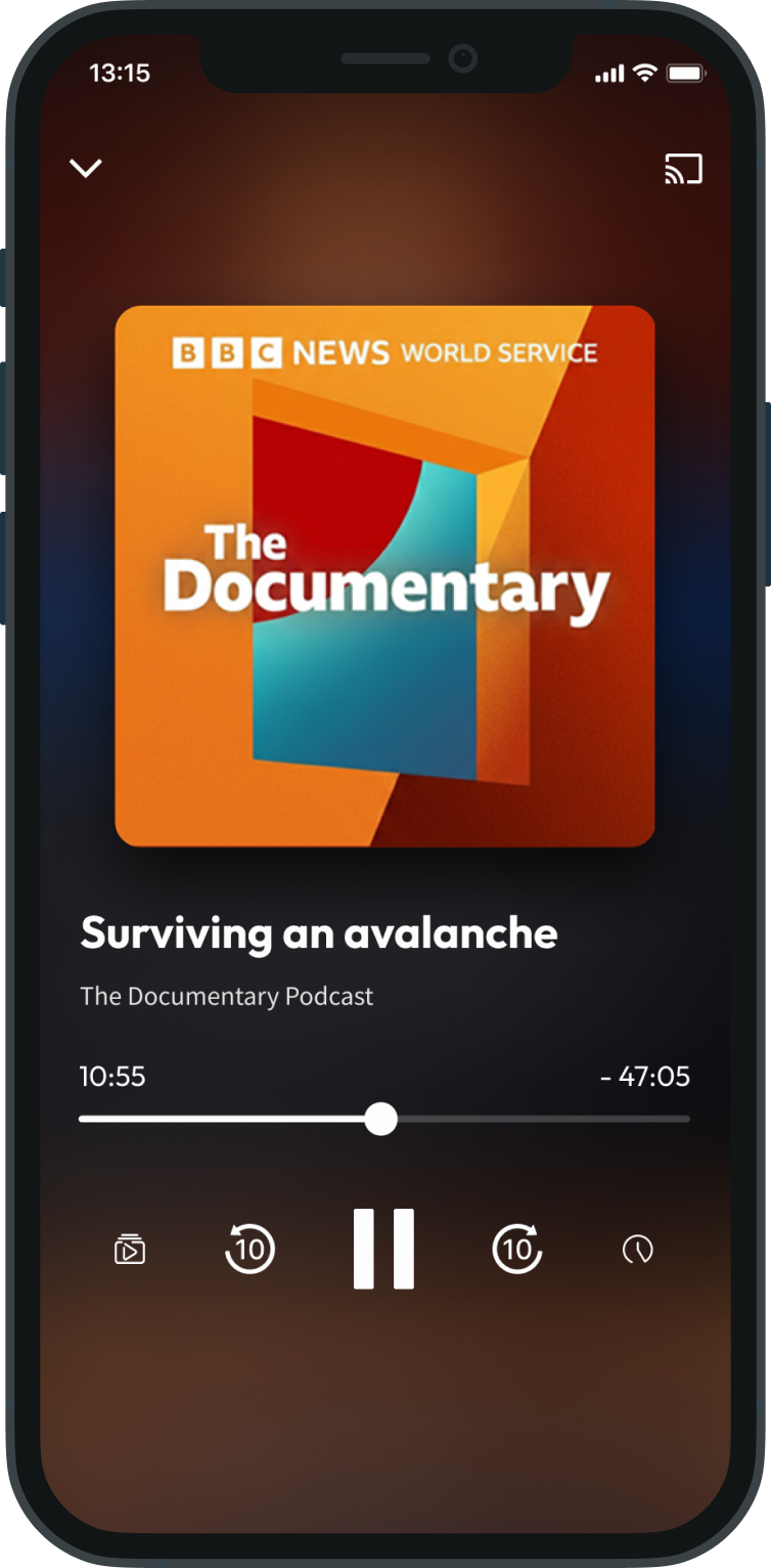
Mobile
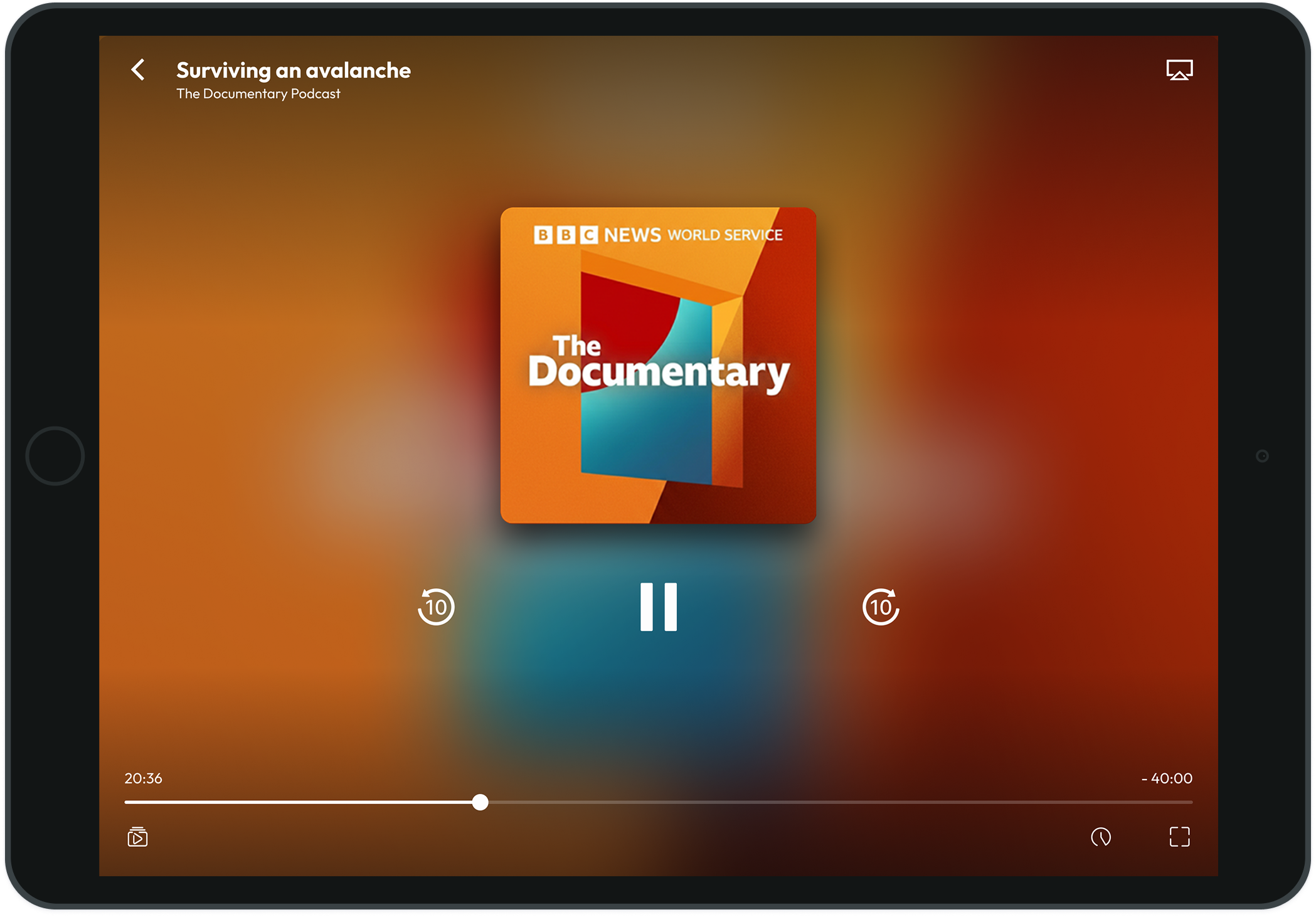
Tablet
Outcome
The work established a reusable audio-playback model across mobile, tablet, web, and TV, giving Accedo One a shared foundation for supporting audio experiences across different customer apps. The pattern is now being rolled out across the platform.
Other cases
Read more of my case studies
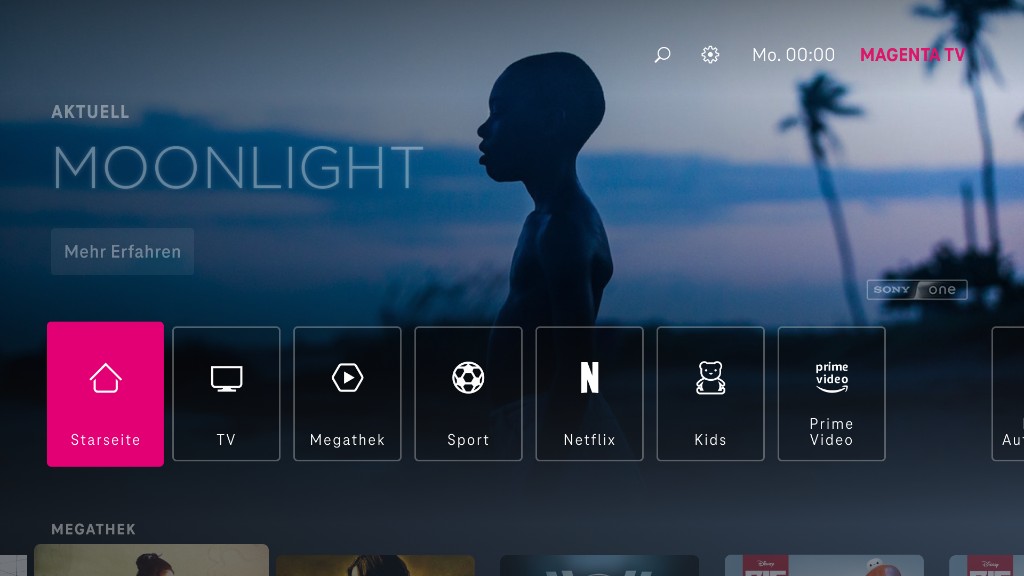
Deutsche Telekom - Magenta TV
Long-term product design across mobile, tablet, and TV, shaping clearer ways to browse, watch, and return to content while adapting shared product logic across devices.
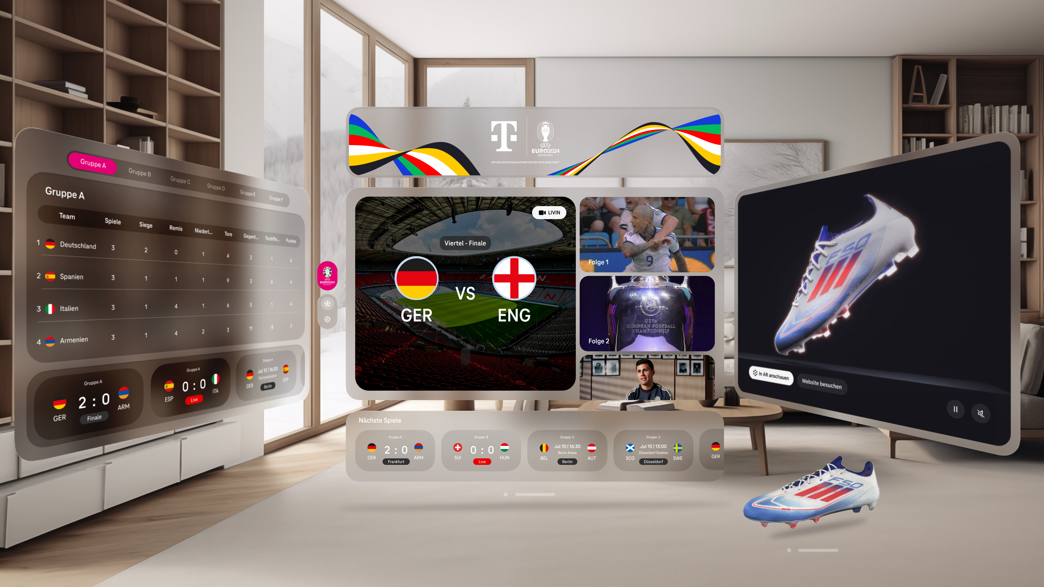
Deutsche Telekom - Virtual Reality Sports
A working live-sports XR experience for UEFA EURO 2024, designed across Meta Quest 3 and Apple Vision Pro in roughly three months.
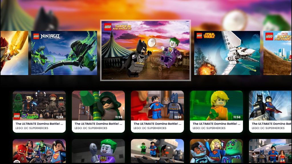
LEGO TV
Sole designer for a child-friendly Smart TV product, leading discovery, UX/UI design, and usability testing with children to simplify navigation and content discovery.